
Chupa Chups:
Dali's Million-Dollar Sucker Punch
It only took one hour for Salvador Dali to create the iconic Chupa Chups logo, He scrawled it on a restaurant napkin in exchange for millions, so who’s the sucker?
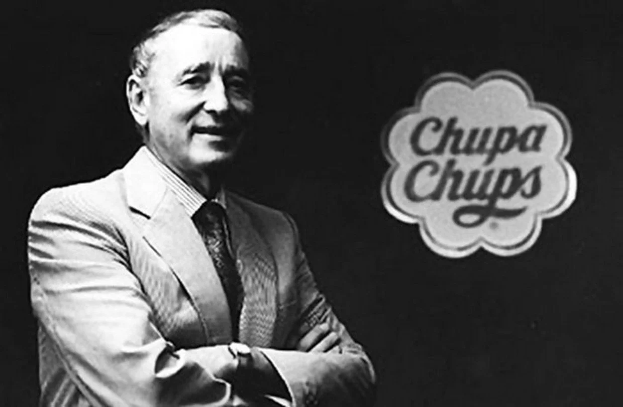
Chupa Chups was founded in 1958 by Spaniard Enric Bernat and is now owned by the Italian-Dutch multinational Perfetti Van Melle (the corporation also owns brands such as Mentos, Smint, and Fruitella).
The term Chupa Chups comes from the Spanish verb chupar, which literally means "to suck”
"I saw that sweets didn't suit their main consumers, youngsters”, Enric Bernat was cited as stating in his obituary. “They had sticky hands and got into a fight with their parents. So I attached the candy to a stick."
Its popularity in Spanish territory was indisputable, with the sweet becoming a favourite among children across the country. The next stage was obvious to someone with Bernat's vision: international sales. However, in order to market the product outside of Spain, it had to be recreated from the ground up. To attract new and potential clients, a hook was required. Enric Bernat flew to Figueres (Girona at the time) to commision Salvador Dali, one of the most influential artists and tastemakers in the world, to design the Chupa Chups logo.
Quoted from “BBC’s Modern Masters”
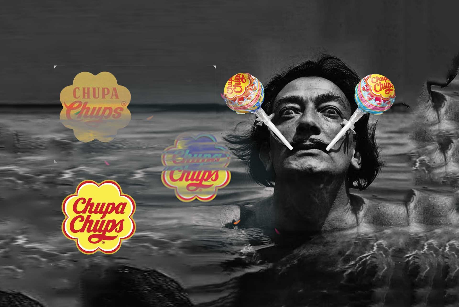
“In 1969, Dali was approached to design a new Chupa Chups logo, and the result became as instantly recognisable as his melting clocks. Dali incorporated the Chupa Chups name into a brightly coloured daisy shape. Always keenly aware of branding, Dali suggested that the logo be placed on top of the lolly instead of the side so that it could always be seen.

The task at hand was to create a new logo that would help the company achieve its objectives. Enric happily paid a multimillion dollar sum in exchange for the eccentric artist's ideas on the logo. Dali pondered for a short while, then drew the daisy logo on a paper napkin. He created one of the most recognisable logos of all time in less than an hour.
Although it may appear that the adjustments were made hastily, the truth is that they were well-thought-out. The use of a single red colour on a yellow background was the first innovation, as it eliminated the three hues red, black, and yellow. The second was to introduce the flower form that surrounds the logo, which is one of the most iconic features of the design and one of the most obvious markers of Chupa Chups' identity. The artist's final contribution was a suggestion to Enric that the logo be placed on the upper section of the box to improve visibility and give it its own identity.

Its first marketing campaign used a logo with the tagline "És rodó I dura moult, Chupa Chups," which translates to "It's round and long-lasting" in Catalan.
To attract more adult customers in the 1980s, the anti-smoking phrase "Smoke Chupa Chups" was used. "Stop smoking, start sucking” with some packaging made to seem like cigarette packs. With the notification "Sucking does not kill," several goods mock the European Union's mandated black and white warning labels.

Chupa Chups now offers lollipops in over 150 countries and over 100 flavours. Enric Bernat, the founder of Chupa Chups, is survived by his wife and five children, including Xavier, the company's president.